The Villages CDC
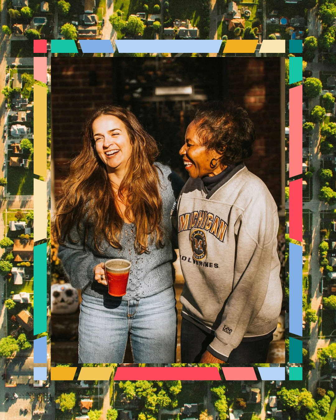
The Villages CDC is a Detroit-based community development corporation serving neighborhoods shaped by distinct histories, cultures, and lived experiences. The organization operates at the intersection of residents, small businesses, and institutional partners to support neighborhood investment while protecting what makes each block feel like itself.
Backtalk was asked to redesign the brand and website from the ground up. The work needed to re-engage residents while also functioning as a credible, durable system for partners and funders. This project wasn’t just about making updates. It was about building a brand their neighbors would recognize, trust, and actually use.
-
The Challenge
The existing brand no longer reflected the community it served. Residents didn’t see themselves in it, and the system felt disconnected from how The Villages actually operates day to day. At the same time, the organization still needed a polished, trustworthy presence for institutional relationships.
The challenge was designing a single system that could hold both realities — welcoming and human at the neighborhood level, credible and clear at the partner level — without defaulting to generic “community” visuals or flattening difference into sameness.
The Strategy
Rather than layering on new narratives, we focused on building a system that could hold complexity without overexplaining. One that felt human at the neighborhood level and credible at the institutional level, without changing tone depending on who was looking.
By designing for clarity, repetition, and internal adoption, the brand became less about messaging and more about alignment. The result is a shared structure that supports many voices without needing to speak for them.
Brand Development
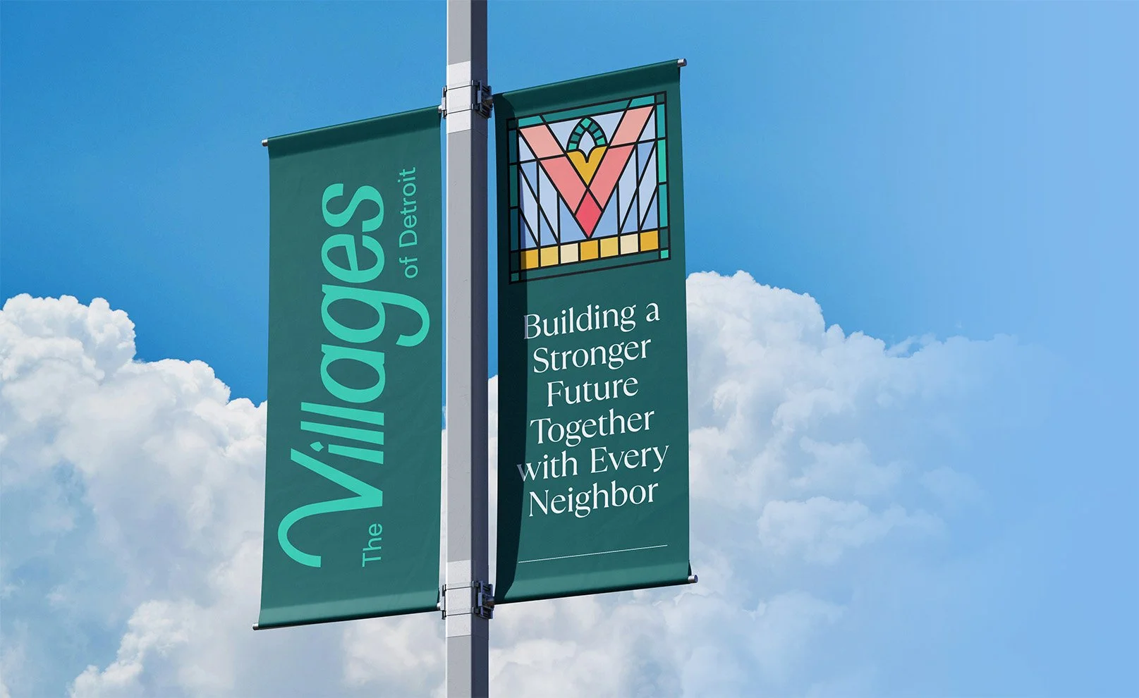
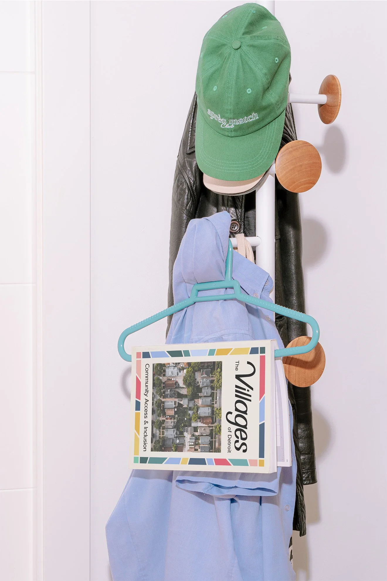
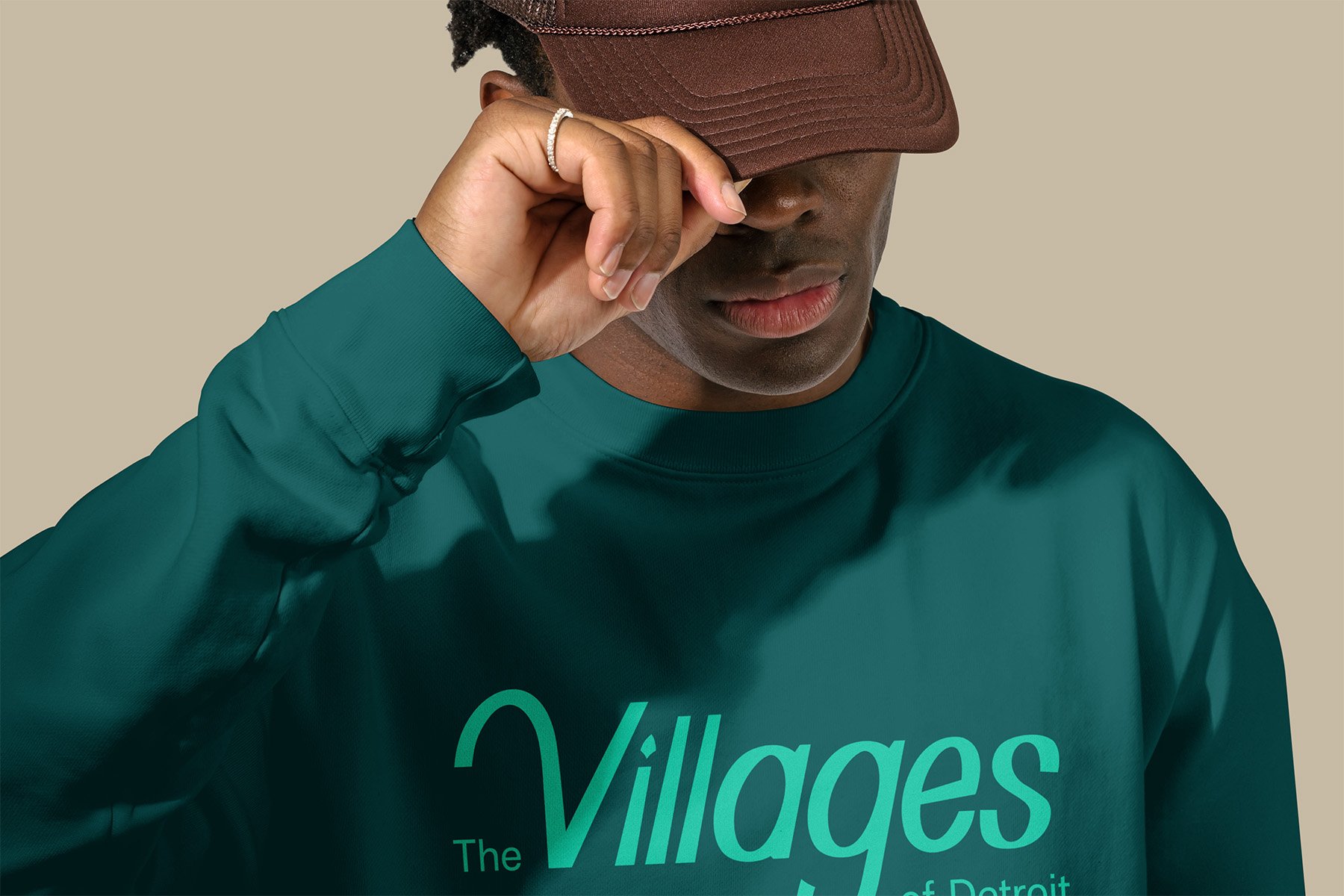
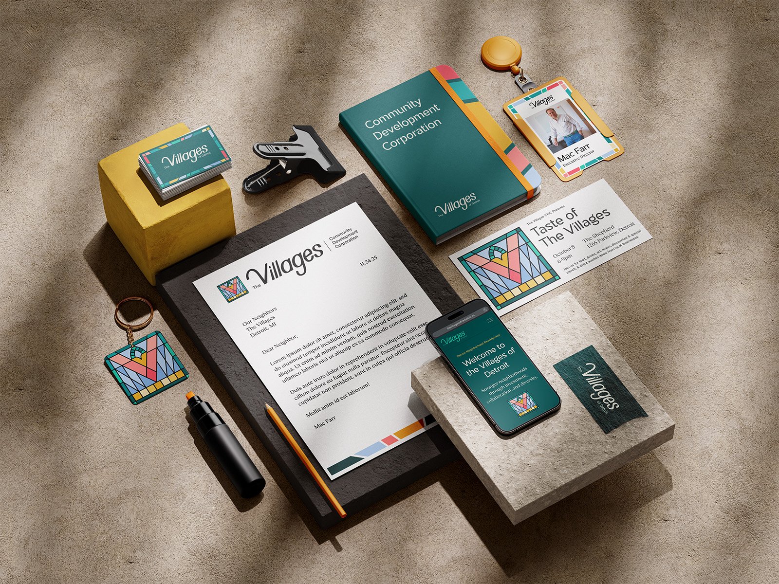
The brand system was designed to reflect The Villages as it exists today: layered, interconnected, and shaped by many distinct parts working together. The aesthetic draws from Arts + Crafts–era influences, grounding the brand in place while presenting it with a gentle modernity.
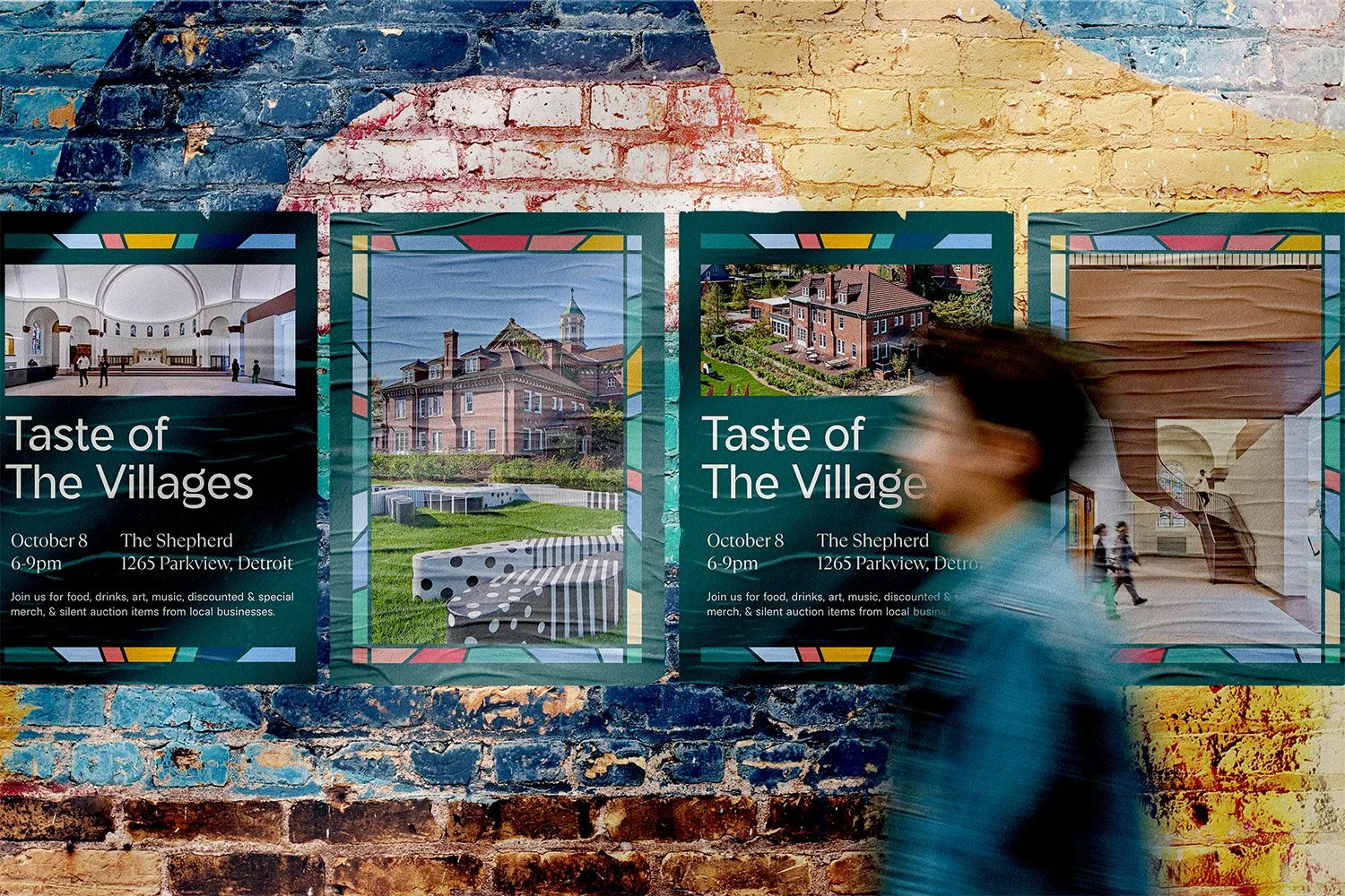
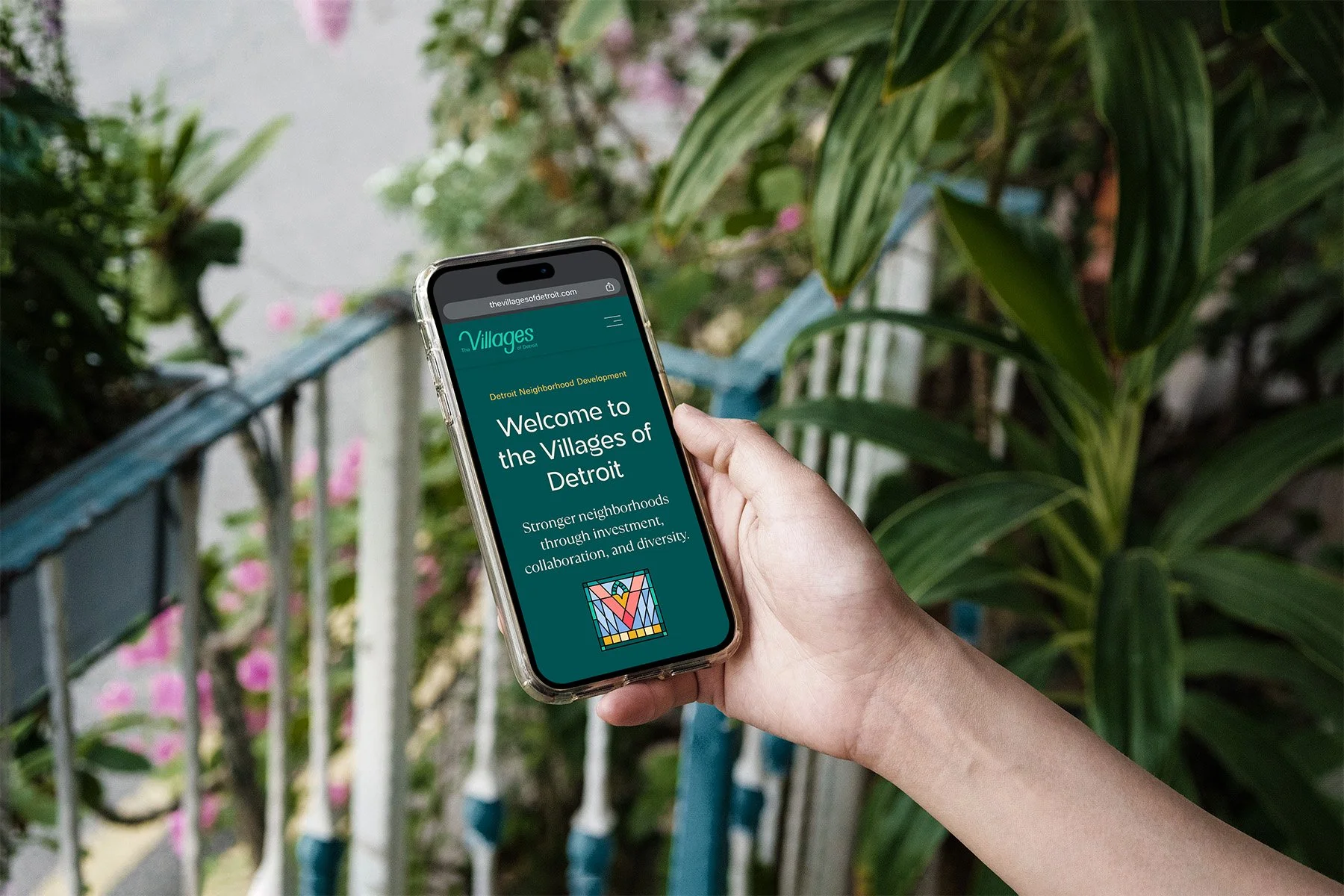
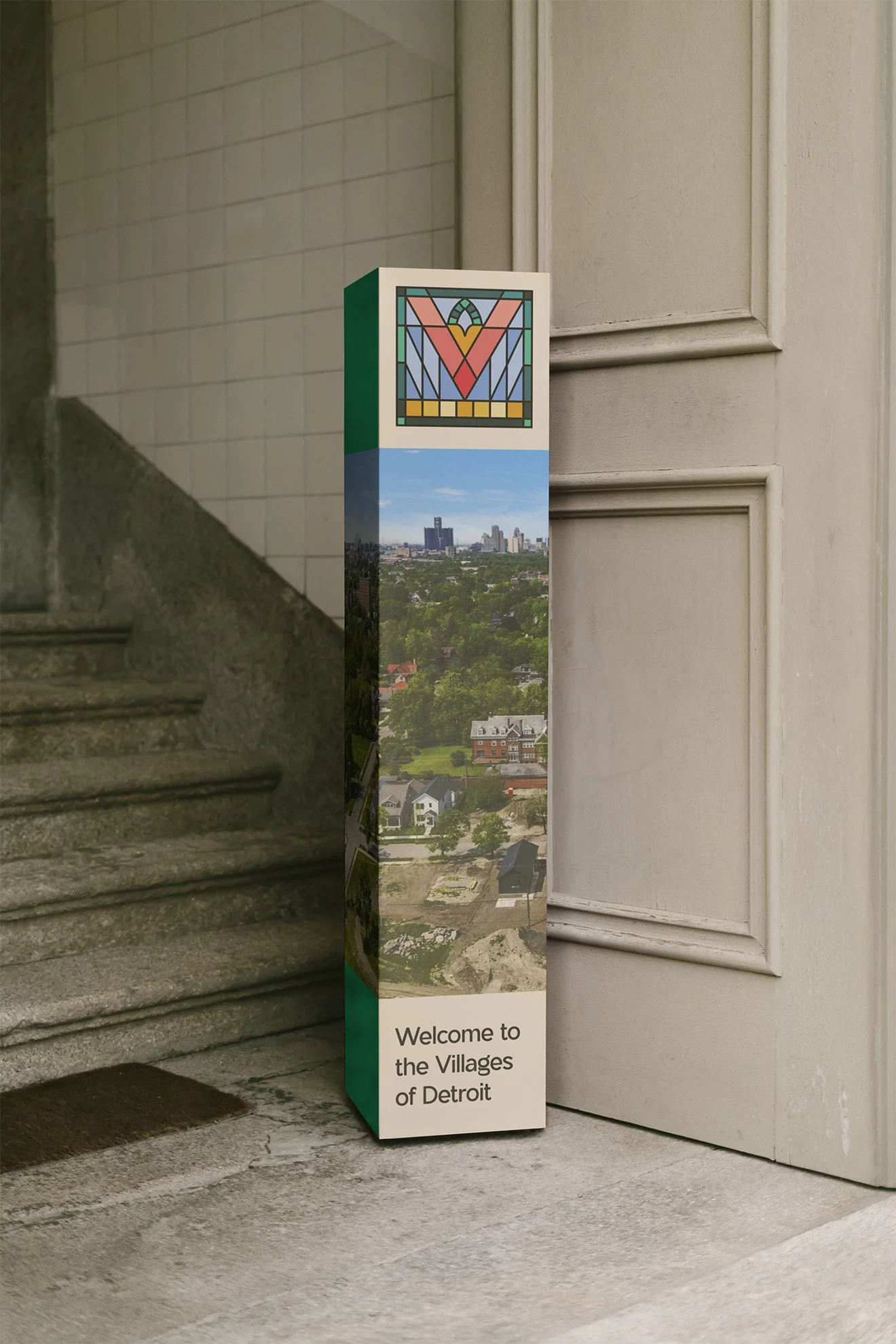
Stained glass became the foundation of the identity. Individual shapes, colors, and forms come together within a shared structure to mirror how the neighborhoods function as part of a larger whole while retaining their own character and history. The primary brand mark, for example, holds seven yellow glass panes at the foundation of the “V” to represent the seven neighborhoods served by The Villages. Subtle nods like these acknowledge the equal importance of each community within it.
The system was designed to feel warm, adaptable, and durable, with softened forms and simplified geometry that allow it to flex across programs, communications, and platforms. The final deliverable was a comprehensive brand guidebook built for everyday use by the CDC’s in-house team.
Design
We created a complete collateral system built for real-world application, not one-off moments. This included a suite of custom, user-friendly Canva-based templates for social media, events, reports, and ongoing communications. Everything was designed to be repeatable and adaptable for the Villages’ team to maintain without outside support.
Web Design + Development
The website was redesigned and rebuilt on Squarespace to give the team full ownership of their digital presence. We restructured navigation, refined all site copy, and designed a mobile-first experience that highlights programs, events, small business resources, and neighborhood initiatives.
The site now functions as an active engagement tool rather than a static brochure. Development was completed in collaboration with Orso Design Co., including a domain transfer, QA, integrations, SEO fundamentals, and launch support.
Project Notes
This project reinforced that community brands don’t earn trust through volume or decoration. They earn it through accuracy. When people don’t feel reflected, they disengage. When a system mirrors how a community actually works, participation follows.
The strongest community identities aren’t loud. They’re sturdy. They hold many voices at once and still feel cohesive. That balance is where meaningful impact lives.
Services
Brand Development
Design
Web Design + Development
NEXT: Eumelanin