Washed Up Coffee
Washed Up Coffee is a Detroit-based coffee brand founded by Emily and Amélie, built around global sourcing and intentional curation. The name reflects the founders’ years of experience in the coffee industry. It signals a laid-back but intentional attitude. Confident, seasoned, and never pretentious.
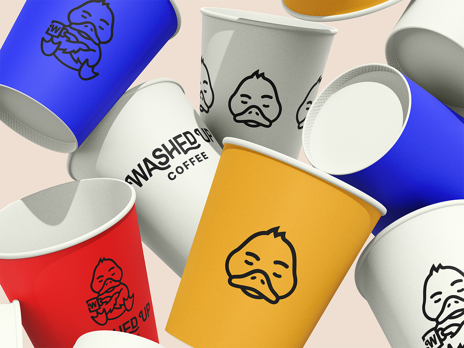
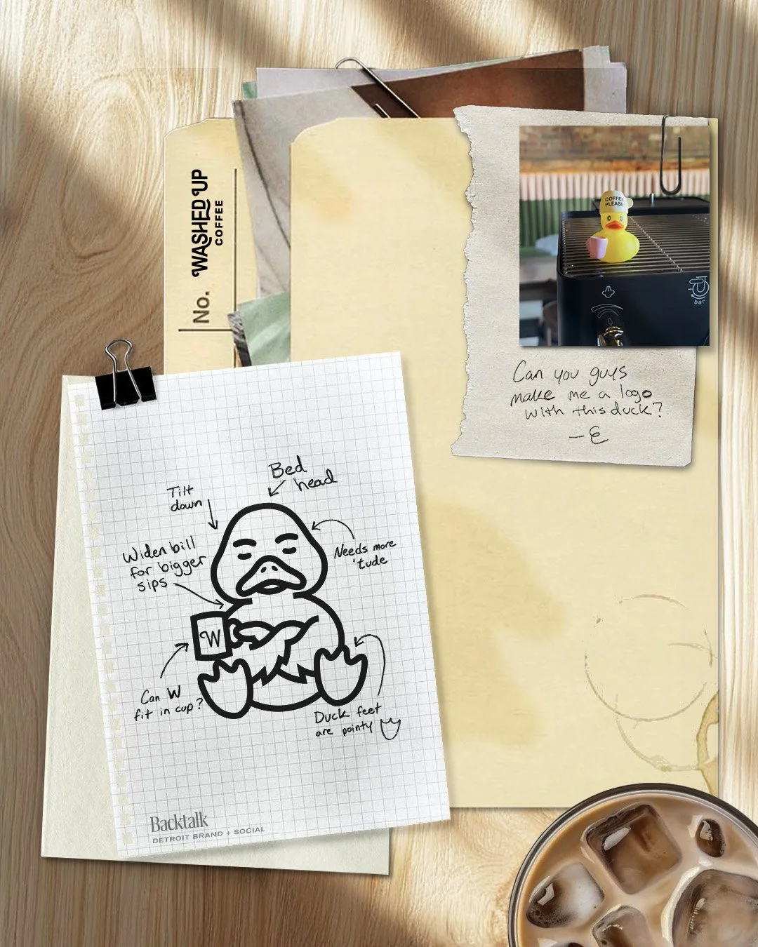
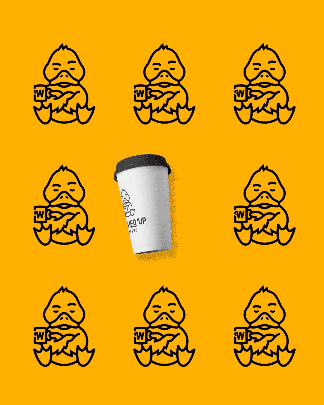
From the start, they knew brand and marketing would be central to their growth. They came in with one clear direction: a duck would anchor the identity.
Backtalk collaborated with them to build a distinct, scalable visual identity system designed to grow with the business and support curated global partnerships.
-
The Challenge
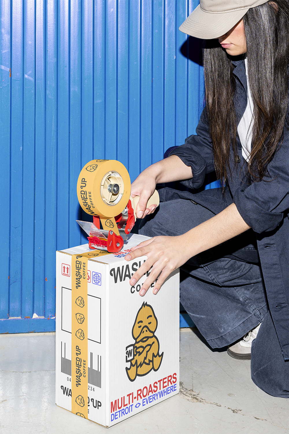
Washed Up Coffee was built as a multi-roaster concept, featuring globally sourced coffee alongside the founders’ own offerings. The identity needed to be distinctive and cohesive while coexisting with a wide range of external packaging styles. At the same time, the duck mark could not feel novelty-driven. It had to communicate experience, credibility, and warmth.
The challenge was to create a brand that balanced seasoned industry knowledge with approachability; a place where quality is taken seriously, but never feels exclusive.
The Strategy
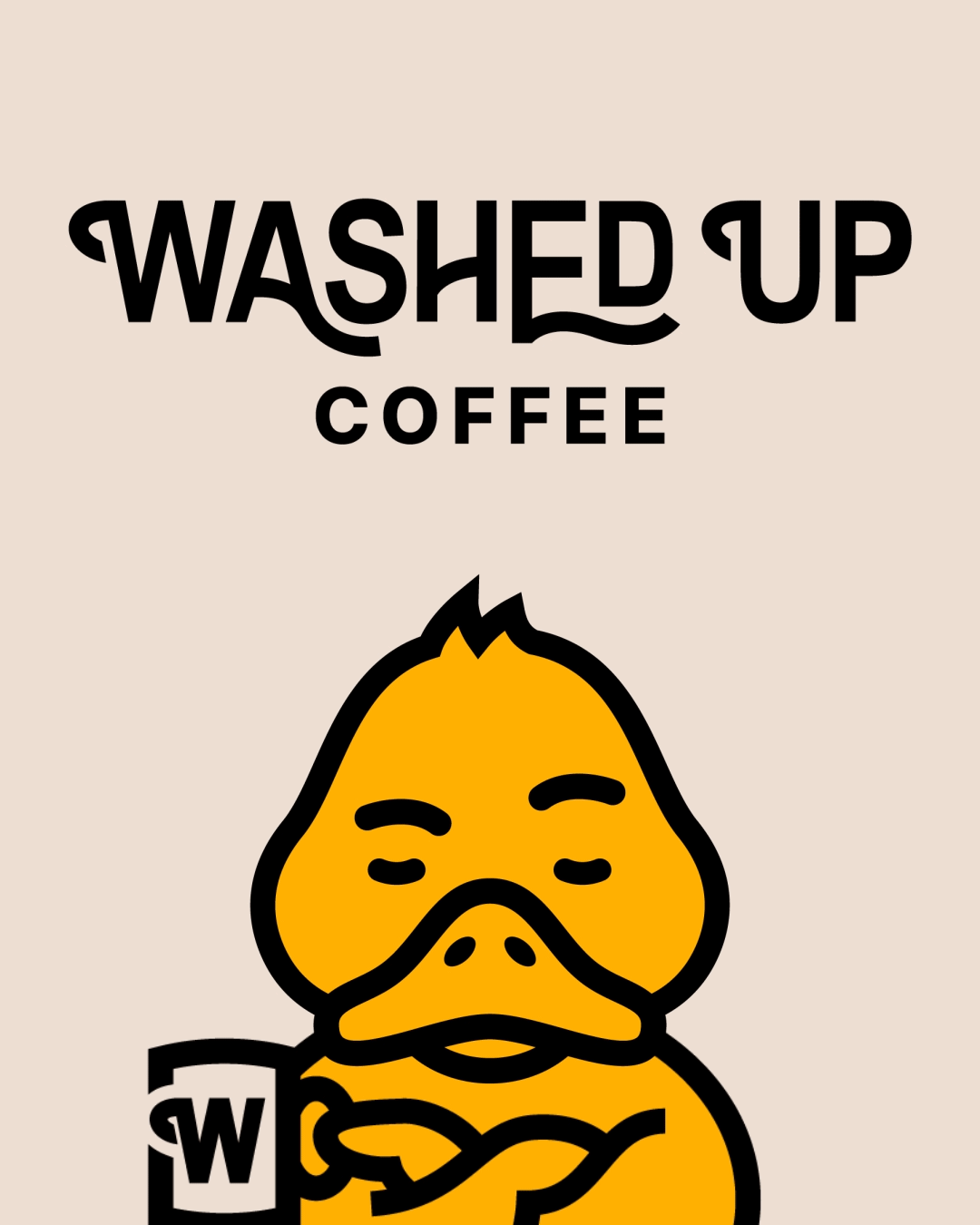
Strategy focused on defining Washed Up Coffee as a curated coffee platform rather than a single-label café. The approach centered on building a character-led identity that communicates experience without pretension and personality without gimmick. The result is a flexible brand system anchored by a distinctive duck mark, designed to scale across retail, collaborations, and evolving environments.
Brand Development
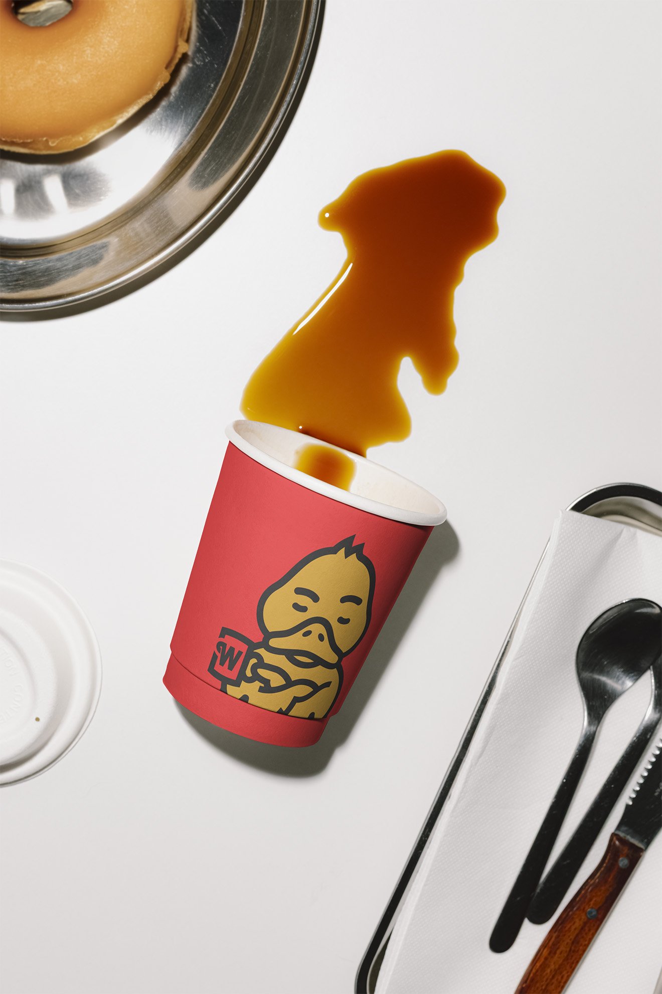
We developed the duck as a fully realized character rather than a novelty logo, carefully refining its expression to balance credibility with warmth. That emotional play became the anchor of the brand.
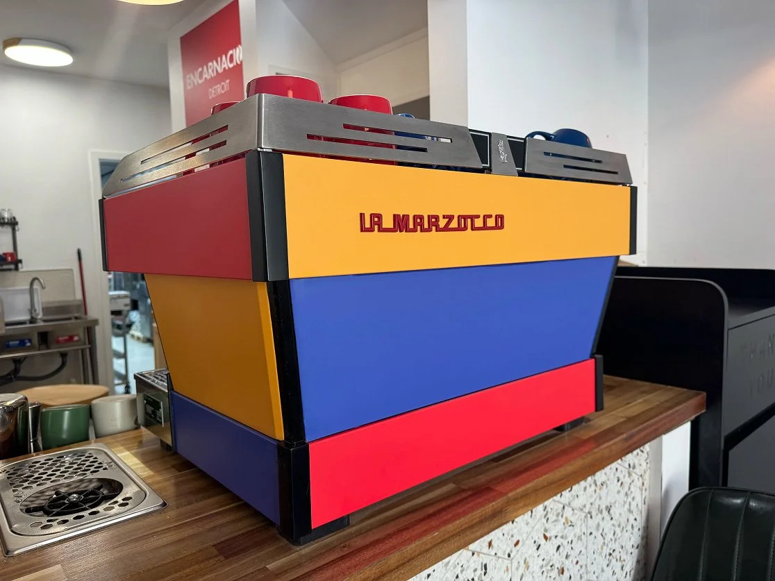
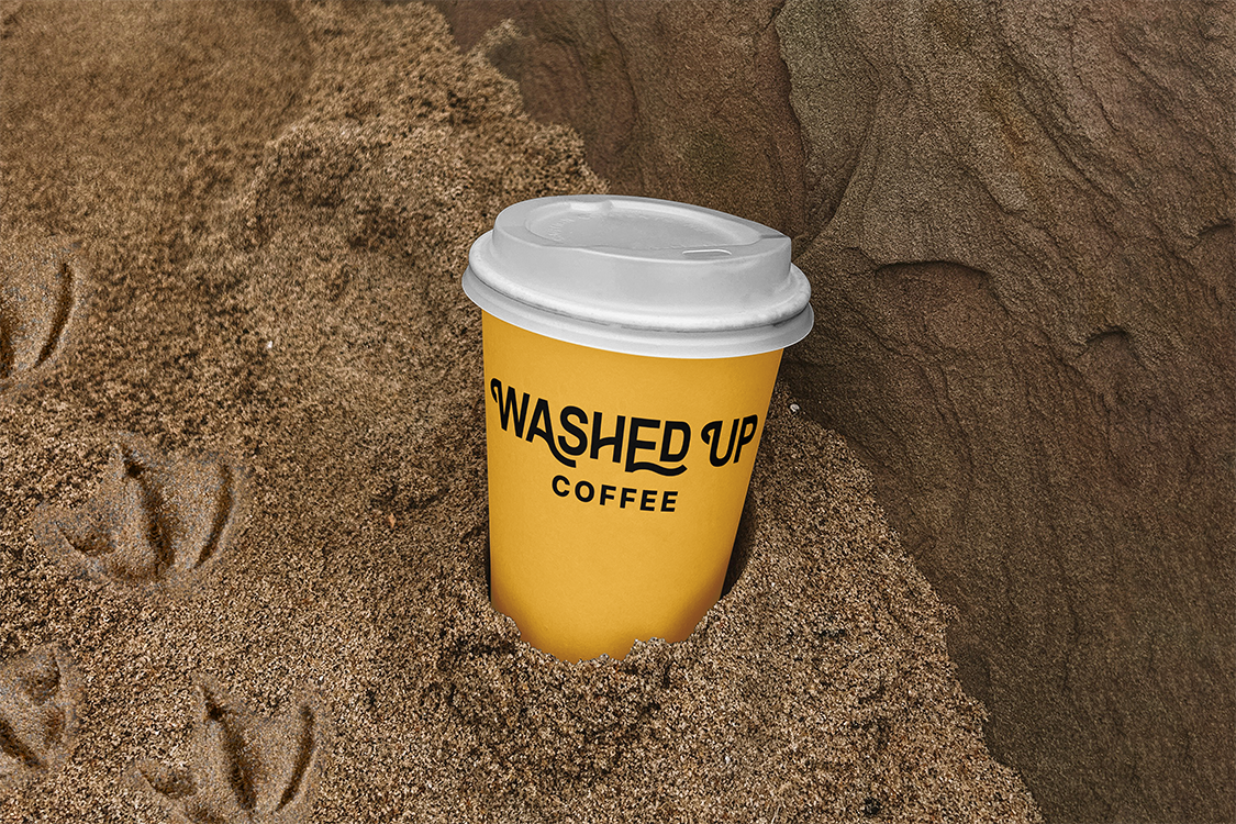
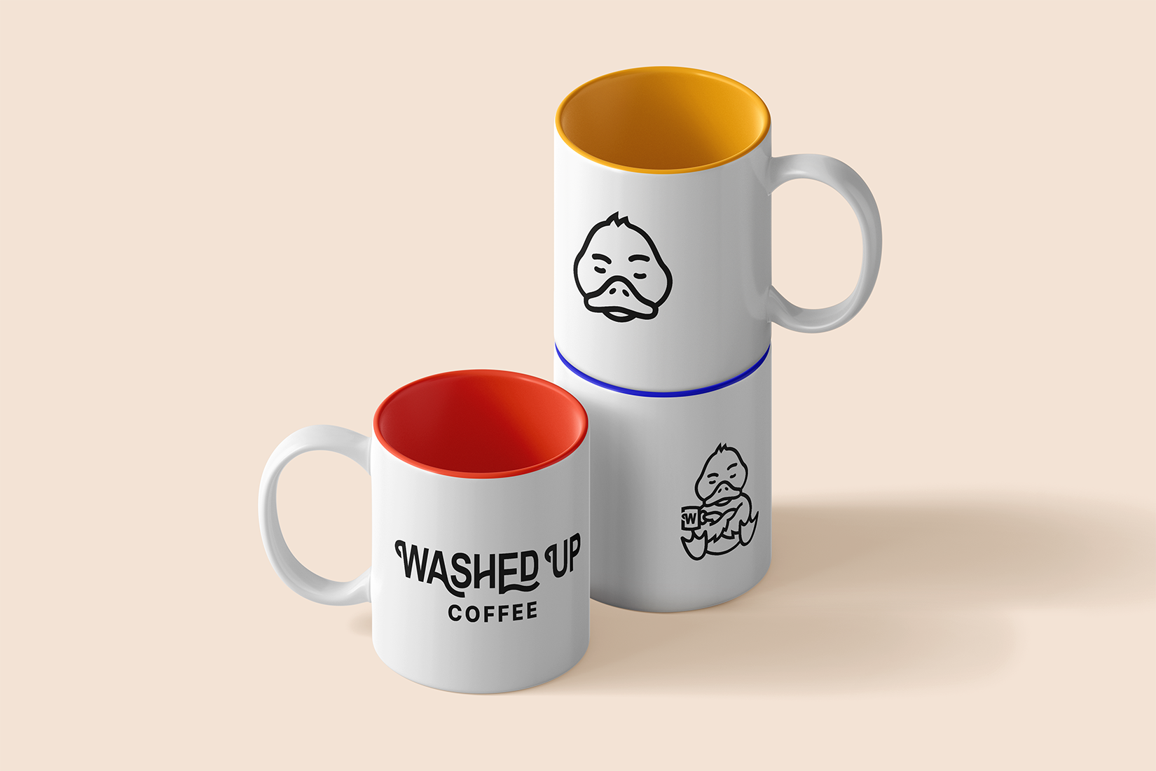
From there, we built a disciplined visual identity system with intentional color, typography, and flexible logo variations, resulting in a confident identity that stands on its own while seamlessly supporting the curated roasters it showcases.
Project Notes
This project required precision in personality. A slight shift in line weight, eye shape, or posture completely changed how the duck was perceived. Because the character represents real industry experience, its expression had to carry both credibility and warmth. Playful, but never cartoonish. It was a reminder that visual nuance isn’t decorative. It’s strategic.
It also reinforced that character-driven brands can’t survive as gimmicks. They have to operate as systems. By designing the duck to flex across merchandise, digital, collaborations, and cultural moments, we built an identity that can evolve with the business, staying recognizable, relevant, and unmistakably its own.
Services
Brand Development
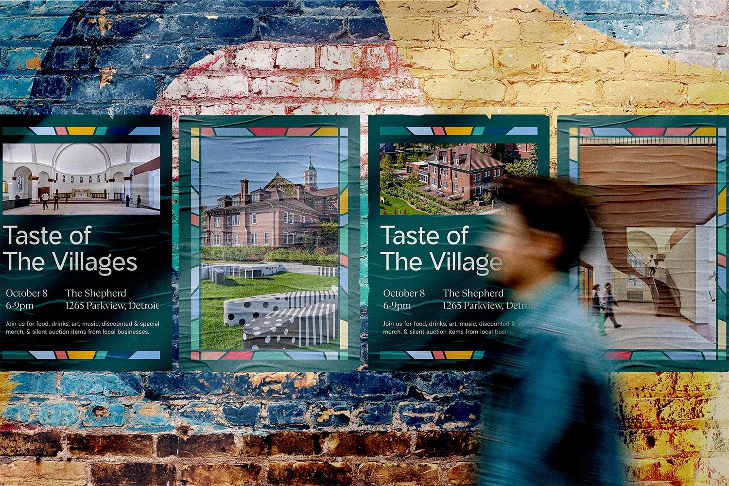
NEXT: The Villages CDC